Principles of UI, A Thread:
Aug 26, 2019
- Natural Mapping:
user interfaces typically “map” to the system they control, each button and dial corresponding to some element of the system. Natural mapping is when the interface forms an obvious spatial relationship to the system, such as 4 stovetop dials that are in the same arrangement as the stovetops. the anti-pattern is arranging controls in an arbitrary order with no spatial correspondence to the system.
- Visibility of System State:
Software typically has state (to state the obvious), such as “where” you are in the software’s menu system, what “mode” you are currently in. whether your work is safely stored on disk or has “unsaved changes”, what stage of a process you are up to and how many steps are left. Failure to effectively communicate system state to the user is inviting them to get lost and make mistakes. counterexamples: setting the time on a digital wrist watch, programming a VCR
- Discoverability
this is about making the possible actions in a system visible- or if not immediately visible, the mechanism of their discovery should be visible and consistent. For instance, the menu items in a GUI system are discoverable. the available commands in a unix system are not. the opposite of this principle is “hidden interface”, examples of hidden interface are rife in iOS: tapping the top of the screen for “scroll to top”, shake to undo, swipe from edge for browser back- etc.
- Constraints and Affordances.
A constraint is something that is not possible in a system. an affordance is something that is possible to do. which is which should be communicated clearly- the nature of this communication breaks down into three subcategories:
physical: visually obvious from the shape of objects in a system- two lego bricks can only snap together in a limited number of ways.
logical: what’s possible or not makes sense logically: e.g. color coding,
cultural: what makes sense within the context of a culture
constraints and affordances is at the heart of the “flat design” vs. “skeumorphism” debate. the benefit of skeumorphic interfaces is that replicating the look of real world objects like buttons, provides a natural way to communicate interactions. where skeumorphism went wrong is communicating false affordances: a detail in the ios6 calendar app hinting that pages could be torn out- when no interaction supported it.
flat design throws the baby out with the bathwater. we still need real buttons.
- Habits and Spatial Memory
this is mostly about not arbitrarily moving around buttons in an interface. people are creatures of habit, and if you fundamentally change the method of performing a task for no good reason, it’s not a “UI revamp” it’s pointlessly frustrating your existing users.
for spatial memory, millions of years of evolution have left us with mental machinery for remembering exactly where something is physically. you can take advantage of this in UI with persistence of space.
an example of this persistence of space concept is the meticulous way some people curate their phone’s launch screens. even better would be if iOS allowed a different wallpaper for each page, and for icon grids to permit gaps anywhere instead of forcing them to sort left to right, top to bottom. the different look of each screen could then be very personal and memorable. Finding an app, then, a matter of finding the page with the right color and shape.
- Locus of Attention
this is a recognition of the fact that human consciousness is single threaded. that while parallel processes permit us to do things like walk and chew gum at the same time, there is only one thread of processing that represents our conscious awareness. therefore, interfaces that expect our attention to be fully present in the status bar, the cursor, the flashing banner ad, the address bar, the lock icon, the autoplaying video and the notifications are misguided.
- No Modes
A Gesture is an action (a keystroke, a mouse move) expected to result in some effect (a letter being added to a document, a cursor moving).
A mode changes the effects associated with some or all gestures. caps lock is a mode. “apps” are modes. Modes are bad if they result in modal error: the unawareness that a mode has been activated, resulting in unexpected effects, and possibly unawareness it is a mode, or how to get out of it. VIM is prime offender. so are modern TVs.
modes are typically employed as solutions to the situation of the number of functions in a system far exceeding the number of available external controls. this can happen either as a result of featuritis, or an apple-esque fetish for small numbers of buttons.
suggested remedies include quasimodes like the shift key, that activate a mode only while a button is being held down. another approach is developing composable UI conventions like GUI menus, or search, that can scale without modes.
another way of looking at this is examining how much context a user needs to understand what effect a gesture will have, and how effectively that context is being communicated. Can i write a step for step guide to doing a task on a computer, for a computer novice, that doesn’t include first determining where in the operating system you are, whether the correct application is open, figuring out which of many methods can get you into that apllication are applicable in that situation?
no.
this is what was nice about the “home” button on iphones: it doesn’t matter where you are in the system, there’s a physical hardware clicky button that will always bring you back to the start, and cannot be overriden by third party software.
apple ruined it with the iphone X swipey home gesture. not only is it hidden interface, but it’s modal now-which edge you swipe depends on the orientation sensor, and is —- sometimes but not always visually indicated by a line that is maybe correct.
- Fast Feedback, see also 17. Consider the 3 important limits of your user’s patience.
why is this important? because without fast and constant communication, the UI will feel broken. it’s why a chattering cli log feels faster than a crawling progress bar. the gui might, on stopwatch time, be faster than the CLI, but time perception works differently, it works with feedback and delays.
- do not cause harm to a user’s data or through inaction allow user data to come to harm
- prefer undo to confirmation boxes. For actions that can’t be undone, force a “cooling off” period of at least 30 seconds.
- measure using Fitt’s, Hick’s, GOMS, etc. but always test with real users.
- don’t assume that your skills or knowledge of computers as a designer or programmer in any way resemble the skills or knowledge of your users.
- Consider the natural order of tasks in a flow of thought. Verb-Noun vs. Noun verb. Dependency->Dependants vs. Dependants->Dependencies.
- Instead of having noob mode and advanced mode, use visual and logical hierarchies to organise functions by importance.
- Everything is an interface, the world, learning new things, even perception itself
- Consider the psychology of panic. Panic kills scuba divers, panic kills pilots. panic kills soldiers. panic loses tennis matches. Panic leads to stupid mistakes on a computer.
more at: ask tog
- Consider the 3 important limits of your user’s patience:
0.1 second, 1 second, 10 seconds
Response Time Limits: Article by Jakob Nielsen
- An interface whose human factors are well considered, but looks like butt, still trumps an interface that looks slick but is terrible to use. An interface that is well considered AND looks good trumps both, and is perceived by users to work better than the same exact interface with an ugly design.
- Don’t force the user to remember things if you can help it. Humans are really bad at remembering things. This includes passwords, sms codes, sums, function names, and so on. My own personal philosophy is to consider humans a part of your system, and design around our shortcomings instead of thinking of users as adversaries. Software should serve humans, humans shouldn’t serve software.
- Some Sources:
Donald Norman
Jef Raskin
Jacob Nielsen
Bruce “Tog” Tognazzini
I recommend all the talks by Alan Kay and Bret Victor, here’s two:
Doing with Images Makes Symbols - Alan Kay - YouTube
The Future Of Programming - Bret Victor - YouTube
- Gall’s Law:
A complex system that works is invariably found to have evolved from a simple system that worked. A complex system designed from scratch never works and cannot be patched up to make it work. You have to start over with a working simple system.
- show, don’t tell. lengthy tutorials and “protips” forced on the user at app start usually do nothing other than get in the way of the user’s task. if you want to teach the user about a feature, include easy to find examples.
- don’t interrupt flow of thought. if a user is opening an application, they usually have some specific task to complete. nagging them at this point in time about software updates or handy tips is very user hostile.
- many jokes are made about the “save” icon looking like a floppy disk. it’s very appropriate, since the command as a concept is built around the technological limits of floppy disks, limits that are comically irrelevant in the 21st century.drag your app out of the 1980s and implement autosave and version control already.
- consistency consistently consistent. there’s few things more fun than designing your own custom ui widget toolkit, css framework, or interaction paradigm. however, please strongly consider not doing this. custom UI is like ugly baby photos. instead, stick as much to the HIG guidelines and conventions of the platform you are on, so users can use what they’ve already learned about where things usually are, and what the fuck the weird molecule icon does.
- try to imagine ways to use your shiny new software to abuse, harass, stalk, or spy on people, especially vulnerable people. ask a diverse range of people to do the same.
then fix it so you can’t. if you cannot figure out how to do your special software thing without opening vulnerable people to abuse, consider not making it available to anyone.
Sep 1, 2019
- UX is ergonomics of the mind (and also body). Where traditional ergonomics considers the physical abilities and limits of a human body, UX considers the limits of the human mind: attention, memory, response time, coordination, emotions, patience, stamina, knowledge, subconscious, and so on. If you ever find a UX practitioner sacrificing accessibility on the altar of so called “good experiences”, you are dealing with incompetence.
Sep 6, 2019
- making your software configurable/customisable allows you to accomodate more diverse users, but it also makes your software more complicated and harder to document and learn, since a configuration is a kind of mode.
Oct 11, 2019
- Never use a warning when you mean “UNDO”.
while there are many actions you can take on a computer that are non reversible, most of the ones with confirmation dialogs truly are reversible. these boxes should only be used when absolutely necessary, and seriously rethoghr even then. the unfortunate side effect of their overuse has been alert fatigue: people have become accustomed to their typical meaninglessness and dismiss them without reading, even important ones
https://web.archive.org/web/20200331195803/https://alistapart.com/article/neveruseawarning/
- Avoid alert fatigue at ALL costs.
imagine the marketing department got their hands on the fire alarms. they would almost certainly use them every day to gather the entire building to one spot, and megaphone about the latest 30% off sale at Myer.
when there’s something actually important, like a real fire, people would die, and it would be marketing directly responsible for those deaths.
this is why letting app developers register notifications on your phone was a huge mistake.
a multifaceted solution to alarm fatigue (pdf)
https://delftdesignlabs.org/wp-content/uploads/2017/07/124-nlugtenburg.pdf
- don’t rely on the user to have fast reaction times, or high levels of hand eye coordination. this is as much an accessibility guideline as it is a usability guideline. Primary offenders are things like double clicks, rapidly changing search results, drop down menus, popouts that rapidly appear and disappear, and in general bait and switch buttons.
prime offender: twitter auto refresh
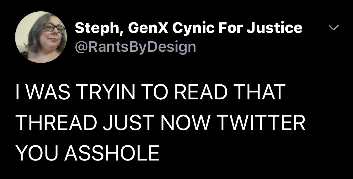
Twitter post from @RantsByDesign: I WAS TRYING TO READ THAT THREAD JUST NOW TWITTER YOU ASSHOLE
- don’t confuse a steep learning curve for bad UI. don’t confuse something that is just similar to what you’re used to for good UI. Don’t confuse the level of pain you went through to learn something with its intrinsic worthiness. The only “intuitive” interface is the nipple.
(not actually true, there’s a whole job for teaching babies how to breastfeed, but that’s the catchphrase for this one, sorry.)
- the subjective experience of a UI is often vastly different from the objective reality of the system, particularly with regards to perception of time and mental models about what the computer is actually doing and how it works. The Watched Kettle effect. For instance, shortcut keys feel faster but are measurably slower than just using menus. A file copy routine can be made as fast or slow as you like but the perception of its speed is down to how the progress bar is animated.
- The user maintains a mental model of the system in their mind, a representation of the way the system works that helps them percieve situations, respond to situations predict outcomes and solve problems. It’s the software UI’s responsibility to either help the model become more accurate, or intentionally abstract and deflect the mental model from the truth. A user with a wrong mental model making an inaccurate prediction leads to user frustration.
- the brain structures responsible for human memory and perception of time are wired directly to the amygdala: the seat of human emotion. a session at a computer will be represented by an episodic memory, regulated by the user’s emotional state at different points in time. frustrating experiences will be represented more prominently in memory than “average” experiences. the last experience in the episode is more prominent than experiences in the middle. our memory is structured narratively.
an amusing consequence of #35 is what a study about colonoscopies can teach us about software interfaces.
https://www.fool.com/investing/general/2013/06/30/the-colonoscopy-theory.aspx
- the law of conservation of complexity. Every system has an irreducable minimal amount of complexity. The only question is, where will you put the complexity? on the user, the application developer or the platform developer?
- lawsofux.com contains another numbered list of of principles that amazingly mostly does not overlap with this one.
- Gestalt, or “the sum is greater than the parts” refers broadly to the repertoir of tricks the human mind has for completing patterns from incomplete evidence. I could go on and on about it, but i found this great article summing it up along with examples of how it applies to various UI situations
- this might seem obvious, but it’s violated enough times to make it worth saying: if you’re making a UI for a touch screen, make the buttons big enough for adult human fingers. Apple reccomends at least 40x40pts
- Convention over experimentation.
There are many arbitrary decisions in UI design. for example: where to place the search bar? fundamentally, it doesn’t matter what you do, but if there’s an established convention please use that. Place the search bar on the upper right hand side of your global nav; not because there’s science to back that up but because if you put it there I’ll be able to guess where it is. that’s where most sites put it. Don’t make me search for search.
- Dark Patterns
Dark patterns refer to the repertoir of UI designs and techniques intended to trick or coerce a user into doing things or agreeing to things either with or without their knowledge. a windows prompt that registered closing the window as agreement to upgrade, prompts that give only the choices “ok” and “later”, or sign up sheets that hide the “skip uploading my contacts” link with a small dim font (twitter). If you do any of these, I think you’re probably a rapist too.
I don’t say that last part to be hyperbolic. lack of respect for other people’s consent runs deep and affects everything you do. Implementing a dark pattern is a fucking sign.
Jun 9, 2020
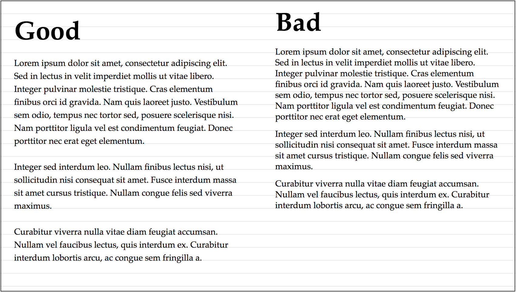
- for legible body text, optimal line length is 60-70 characters per line. no fewer than 35, no greater than 80. going longer than these ranges makes it difficult for the eye to track back to the beginning of each line. go shorter and reading becomes stuttered, like reading a telegram. or a toot.
Jun 20, 2020
- The web, and UI frameworks will fight you on this, but if you establish a vertical rhythm in your typographic grid, you’ll increase the feeling of unity in the design and help the eye flow better across the design. Choose a verrical spacing that suits the size and style of your main text font. there’s no hard and fast rules, but it’s good to aim for the vertical spacing to be around 1.33-1.5 the point size of your body text. heading sizes can be neat integer multiples of 1/2 or 1/3 of main
- Past the age of 40, vision tends to decline at a steady pace. mine certainly has. Us old people can’t really deal with font sizes much below 14pt- which tends to look large and goofy to younger folk. whatever size you choose or however you set up your grid, please gracefully permit users to override your choice, and ideally design and code your thing to not break when this is done. this isn’t just politeness, it’s the law in USA, the UK and Australia, along with the rest of WCAG 2.0
I mean, if you set your website at 10px you’re just invoking the wrath of Stella Young’s ghost. watch your toes.
- in olden times, type was carved by hand into metal for each type size. the different sizes were not just scaled versions of the same design: tiny adjustments were made for each size for color and workarounds for printing technology. With the invention of computer fonts, “hinting” was only done for screens at small sizes, wrong anti-aliasing later accidentally mimicked the effect. Few noticed laser printed documents looked slightly wrong or why. Now retina screens have the same issue.
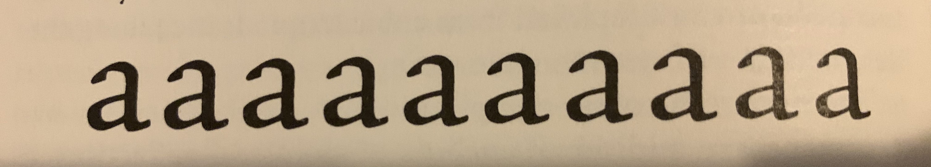
Adobe Jenson MM, various point sizes from 18pt to 72pt, scaled to the same size to show the changes in glyph design. Multiple Master fonts were a brief flash in the pan, a format that reprduces the effect, but only if you use the specific adobe software that supports the format.
- Untitled%20toot%208_FINAL.docx
less a principle than a specific criticism of a ubiquitous concept.
problem: filenames try to be both a programmer interface and a user interface and it’s bad at both. spaces, special characters and long names cause problems for programmers. being overly restrictive causes problems for users. Asking for a filename on file close is the wrong time to ask the user to think about a good findable name- exactly when they’ve just decided to do something else.
- Optical Adjustment
In the course of creating visual designs, designers very very often accidentally create optical illusions. This usually isn’t desirable. Objects the same size appear different sizes. Lines that are meant to be straight look curved. The only way around this is to carefully adjust things by hand until they “look right”. This is called “optical adjustment”
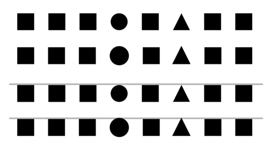
Four rows of various shapes. the first row is a row of squares with a circle and a triangle in the middle of exactly the same height as the squares, but optically appearing shorter.
the second row is similar, but the circle and triangle have been made slightly bigger in order to appear the same height as the squares. the third and fourth rows duplicate the first two, but with gray guidelines for exposing the illusion.
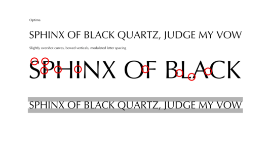
"SPHINX OF BLACK QUARTZ, JUDGE MY VOW" has been typeset in the Optima font. a zoomed in portion of the line of text is duplicated below with red circles highlighting the optical adjustments that have been done in this font: curves that slightly overshoot the base and cap lines, slightly bowed vertical strokes, kerning adjusted on round letters, especially the 'AC' digram which unadjusted would contain an unsightly amount of extra space.
- Things that work different should look different.
in linguistics, false cognates are words that look and sound similar, with similar meaning, but different origin. false friends are words with similar sound but different meaning. software has false cognates and false friends too. In 2018 they nearly ended the world:
Design-Heres-How-Hawaiis-Ballistic-Missile-False-Alarm-Happened
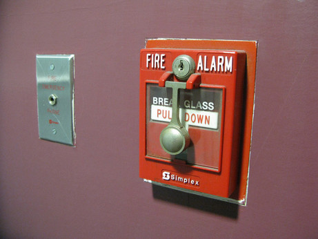
A fire emergency phone plug that kind of looks like a light switch next to a bright red fire alarm switch that is behind glass that must be broken to activate

two aerosol spray cans with identical yellow packaging labeled with identical font. one is “fly and insect killer” the other is “canola cooking spray”
- Figure-Ground and sillouettes.
The fastest and most well developed stage of visual recognition is of the sillouette of an object. In character design, getting the sillouette of a character to be disctinct is most important. in portraiture if you get the shape of the head right, you’re 90% there. it takes far longer to notice the interior features. time how long it takes you to spot what is wrong with adele. This is important in icon design too- don’t mask all your avatars in circles please

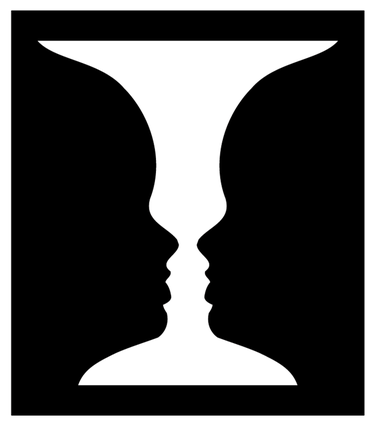
like seriously, i know half of you only as “vaguely orangey smudge”, work on your avatar sillouettes people!!
Jun 25, 2020
- We use too many damn modals.
see also: 10., 23, 29 and 30.
need to use a confirmation box?
are you sure?
cancel, okay.
https://modalzmodalzmodalz.com/
- Humans make mistakes. It’s no use pretending they don’t. You’re just going to have to deal with it. So just make them easy as possible to fix. Include infinite undo, back button, home button, version control.
Autocorrect, I am not so sure about. I for one don’t like the computer to insist it knows better than me and then provide no way to easily insist i am right. Let me make mistakes! just make it easy to fix them.
Jun 30, 2020
- The Perception - Action Loop.
A principle from psychology, it describes a method by which humans interact and learn from their environment. it goes:
- Perceive situation
- make prediction about it
- take action
- observe result. if it matches prediction, reinforce that mental model.
go back to 1.
this principle relates to constraints and affordances, in that the perception step can exploit pre-existing experiences, and observing a result can either reinforce or contradict them
Jul 18, 2020
- reiterating the point, is @enkiv2 “Hot UX take apparently: interactive elements should never change position except in direct response to a user-initiated input event, and should never appear or move while such an event is taking place; while they may change color or contents (for instance, a button inverting in response to a mousedown), their bounding box should never change shape during the course of any event.”
- THE BLANK PAGE problem
-if a user is presented with a blank screen, a blank search field, or a blank page, it can be very difficult to know what to do or what to try. In this case it is better to lead by example, not by patronising tutorial.
Apr 3, 2020
- All manufactured things should be designed to be used by one hand. either hand.
there are safety features of some industrial equipment that require both hands so that both hands are no where near the dangerous hand mangler part- use best judgement
via @space_cadet
Apr 4, 2020
- on Unskippable Cut Scenes.
Game UI seems to live in an alternate universe, immune from both the advances and blunders of mainstream computer interfaces. unskippable Cut Scenes and dialogue bubbles are a staple annoyance for Video Game Afficiandos. What everyone secretly wants is for story cut scenes and dialogues to just be presented with ordinary vhs controls and scrolling text planes to read at our own pace. The game industry is to cowardly to do it for reasons.
Apr 9, 2020
- Negativity Bias
related/mentioned in #35.
humans are wired to notice and remember negative experiences more strongly than they notice or remember positive experiences. negative yelp reviews are more likely than positive yelp reviews. if your software is successful at being easy to use, it will be invisible, and most people won’t remember it.
Apr 10, 2021
- more on episodic memory
ever stand up to do something, walk into another toom and forget what you were doing?
it turns out there’s a reason for this. since human memory is organised around episodes, experiments have found that walking through a door is a trigger for ending an episode- the result? short term memory is cleared and primed for new input.
what triggers exist in software? how often have you picked up your phone to do something, saw a notification and lost your flow?
- Please don’t use confirmation dialogues, but if for some reason you absolutely must, don’t sleepwalk through writing the the messages and the button labels. Don’t just label them “okay” and “cancel” Without thinking about whether that wording harmonises with the message text. If possible, label the buttons as what they actually do, specifically.

Enable ads for rotten tomatoes
or
continue without disabling
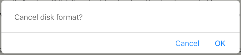
Cancel disk format?
cancel, ok
via @GNUxeava
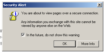
a warning dialogue that says “security alert: you are about to view pages over a secure connection. Any information you exchange with this site cannot be viewed by anyone else on the Web.” a checkbox says “in the future, do not show this warning” buttons “okay” and “more info” a yellow lock icon appears on the left.
via Kyle Hill
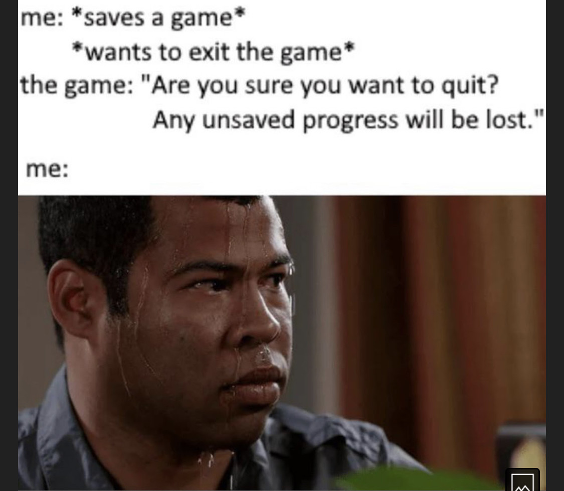
me: [saves a game] [wants to exit the game]. the game: “are you sure you want to quit? any unsaved progress will be lost”.
me: [profusely sweating jordan peele meme image]
how not to manufacture consent
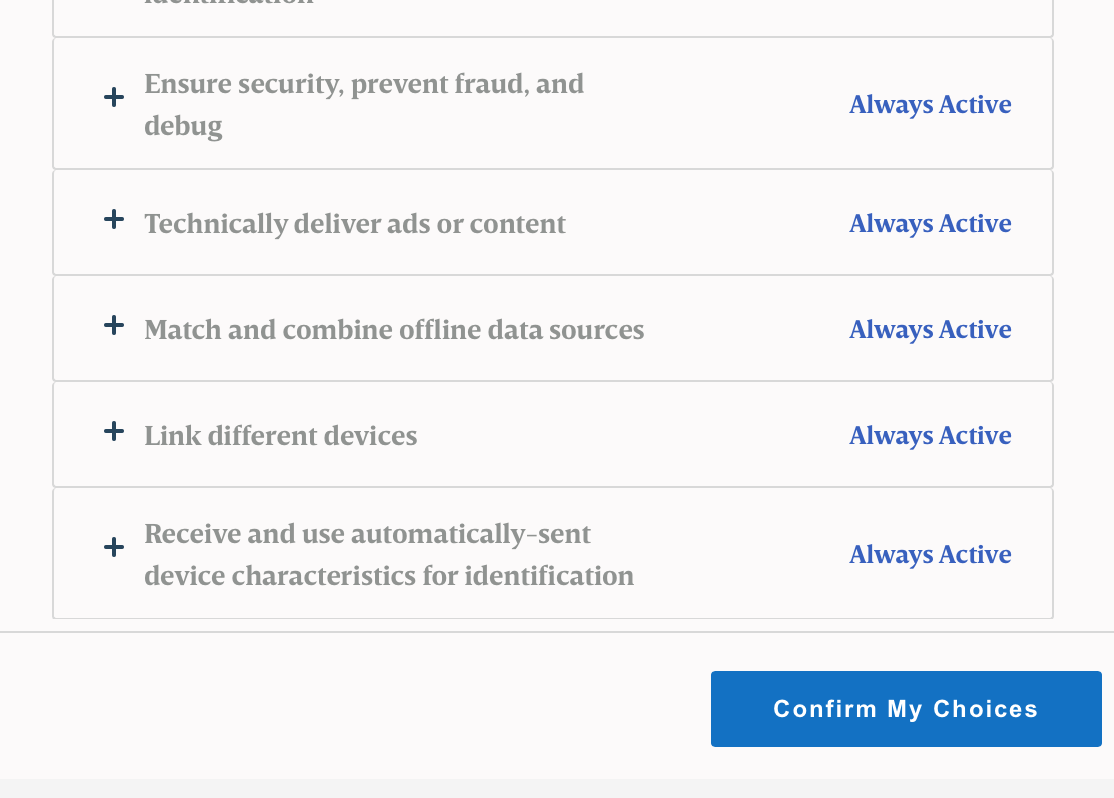
a “cookie consent” dialogue that lists types of cookies with “Always Active” next to them, and no choice to disable them. A button at the bottom says “Confirm My Choices”
Jun 2, 2021
- Plan for failure
software breaks. hardware fails. services go down. users make mistakes. Anticipate as many failure modes as you can, and design recovery plans and craft reasonable, well written communications for the user. Technical writing is its own topic, but for error messages the important things to accomplish are
a. clearly communicate the situation in language that is relevant to the user demographic. e.g. if it’s not a technical audience don’t use jargon
b. explain what to do next
May 21, 2021
- Label your buttons. With words. don’t do clever shit like only showing labels on hover. hidimg the labels is mystery meat navigation.
Jun 21, 2021
- Stop making your updates so intrusive. I open an app to use it. if you force me to stop and update it first i forget what I opened it to do. this is user hostile behavior. Ideally, users should not be bothered about updates at all- but unfortunately they a necessary.
a less intrusive pattern is asking for permission to download and install an update on app EXIT.
just don’t ask using a blocking modal dialog, for the love of durga.
the least intrusive pattern of all is web apps that are just automatically always the latest version, and at worst, occasionally ask you to reload your browser so the front end matches the back end.
this is a tradeoff of course because those updates happen without consent.
Nov 21, 2021
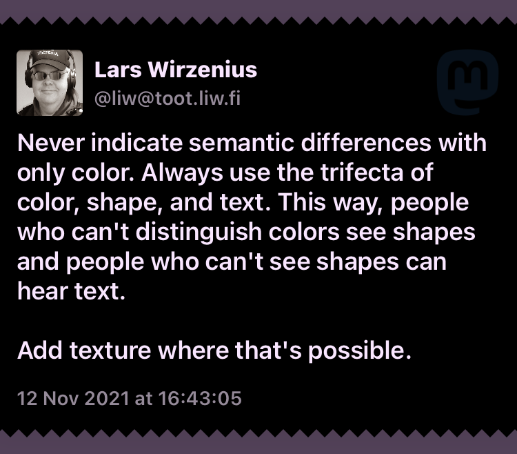
- Never indicate semantic differences with only color. Always use the trifecta of color, shape, and text. This way, people who can’t distinguish colors see shapes and people who can’t see shapes can hear text.
Add texture where that’s possible.
via @liw
Dec 14, 2021
- never steal focus, never generate a button directly under the cursor, never enable a button immediately after it is displayed, never disappear a button immediately after it is pressed.
Apr 28, 2022
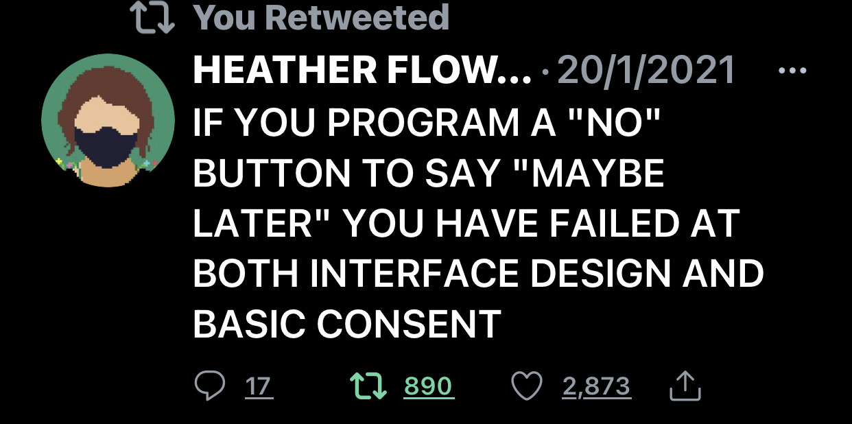
- if you program a “no” button to say “maybe later” you have failed at both interface design and basic consent
via @HTHR
May 10, 2022
- if something has low odds of happening, that means it’s still going to happen. Don’t ever use that as an excuse not to fix a problem, especially if it could cause damage to life or data; or reduce accessibility.
Jun 5, 2022
- don’t do whatever the fuck this is. bad reddit. this made me replace “www” with “old” so fast.
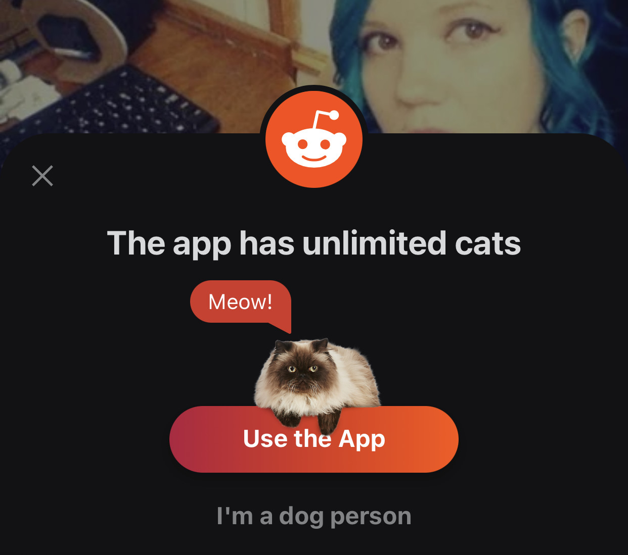
a reddit a pop up confirmation box says “the app has unlimited cats” a cat graphic sits atop a button that says “use the app”, small tiny barely visible text says “i’m a dog person”
no, no you do not
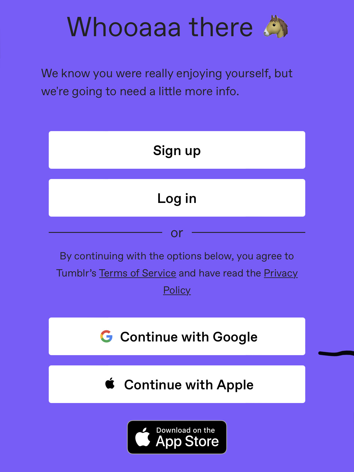
whoah there [horse emoji] we know you were really enjoying yourself but we’re going to need a little more info. sign up. log in. or continue with google continue with apple. download on the app store
what do you even call this pattern? a surveillance wall?
Jul 2, 2022
- don’t assume your users’ devices resemble yours or your close circle of friends when deciding minimum requirements- especially if you intend to reach a wider audience with a range of socioeconomic conditions and internet connection speeds.
brought to you by the Australian government locking welfare payments behind a mininum iOS version.
Jul 7, 2022
- via Jan Niko @nihilazo
nothing a computer does should ever feel like magic. if something a computer does feels like magic, that’s because it doesn’t sufficiently inform you (the user) of what it is actually doing or allow you to create a mental model of the system
Jul 13, 2022
- your ui should not passively animate for anything less important than a carbon monoxide leak.
it’s effective at getting attention, often way too effective.
via @binarycat
Aug 15
- When you require a mobile phone number for authentication, you guarantee that unhoused people will permanently lose access to their email when their phone is lost, stolen or destroyed (roughly every 12 weeks).
via Chad Loder
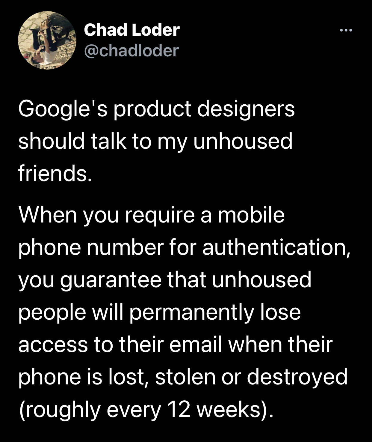
a tweet from @chadloder Google's product designers should talk to my unhoused friends. When you require a mobile phone number for authentication, you guarantee that unhoused people will permanently lose access to their email when their phone is lost, stolen or destroyed (roughly every 12 weeks).