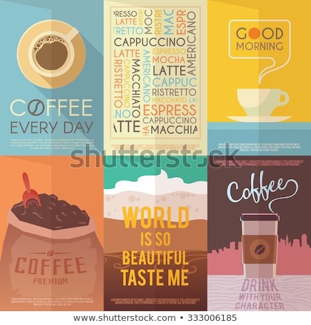
kopi fantasy console
#threads
me: so i have been on and off working on this palette for about 5 years , based on the observation that pretty much all coffee related ephemera uses the same colors. so I tried to reverse engineer the platonic coffee palette, past the little inconsistencies introduced by reproduction technology.
· ·
I eventually found 16 colors. i always struggled to get it down to 8, but i finally got a breakthrough yesterday when i realised i could reproduce many of the colors by mixing others in perfect 2 and 3 color dither patterns. finally i was able to get the two shades of green out of creating a phantom third green that could mix with the existing blue and grey to create my two greens.
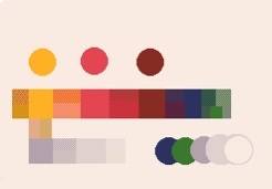
this is the result, which i call kopi-16 and kopi-8
beware: gamma incorrect resampling will darken the dithers.
haha jpeg compression murdered that image. here's the hex codes.
kopi-8
kopi-16
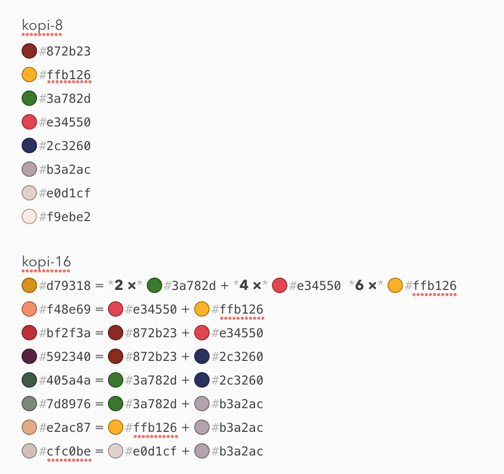
what would be really awesome is if i could get aseprite to exactly translate these colors into my elected dither patterns. then i could compress images first to 16, then to the 8 using exact patterns.
the kopi-8 fantasy console huh! i have my ideas about what this would be. but, starting with this 8/16 color palette, and do YOU think this coffee themed virtual machine would be like? (not java). how would it be different from all the others? would coffee spill based artwork be involved somehow?
kopi is actually the name of a programming language that I have been failing to build due to my lack of skill at writing parsers.
the essence of kopi is that it is a “pure” language containing only expressions. no statements, no side effects. It is a pure espresso language. programs written in kopi are “shots”. any input that it takes must be given to it from the outside. any side effects that result from its evaluation must be done externally by reacting to whatever value kopi produces
in functional parlance, kopi is single origin, artisanal, no sinks. just filtered goodness. That might sound like it cannot do much. but like any embedded language, its capabilities are really only limited by the environment you choose to expose it to.
my aim is for kopi’s syntax to be a superset of json, with some additional operators added on. in this way, it is extremely similar to JQ. though, my issue with JQ is it doesn’t make enough sense to me to remember how it works between sessions without consulting the documentation.
like jq though, its primary “mode” is to take some data from the outside, transform or filter it in some way, and produce some new output value.
how the heck are you supposed to write a game with a pure expression? it’s a good question, and a lot of it depends on the game engine frame you put a kopi shot into. a fantasy console is going to expect your code to be in the form of a “fold” aka a “reduce” function. a fold function takes two arguments as input, the past and the present, and returns the future as its result. this gets called 60 times per second (or whatever step size) and each step, the returned future becomes the new past.
it might seem crazy or wasteful to write a whole game this way, and maybe it is. but it can be done! what?! no mutation?!! noooooo my precious.
so, here’s the even crazier part.
i wanna compile kopi to 6502 machine code.
thoughts so far? i could go into more detail about what’s in kopi, but to be honest i want my hermity insulated brain to be challenged.
so ihave a favourite resolution. what happens if you take the 256x240 resolution of NES and SNES and clip to a 16:9 aspect ratio? 256x144 pixels. that’s the same height as the gameboy games, which could in turn be widened to 256x144.
plus 256 and 144 are my two fave numbers.
what would a coffee themed music chip be like? would it be pan flutes and bass guitars? does a guy in a beret read poetry over the top of it?
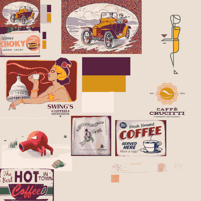
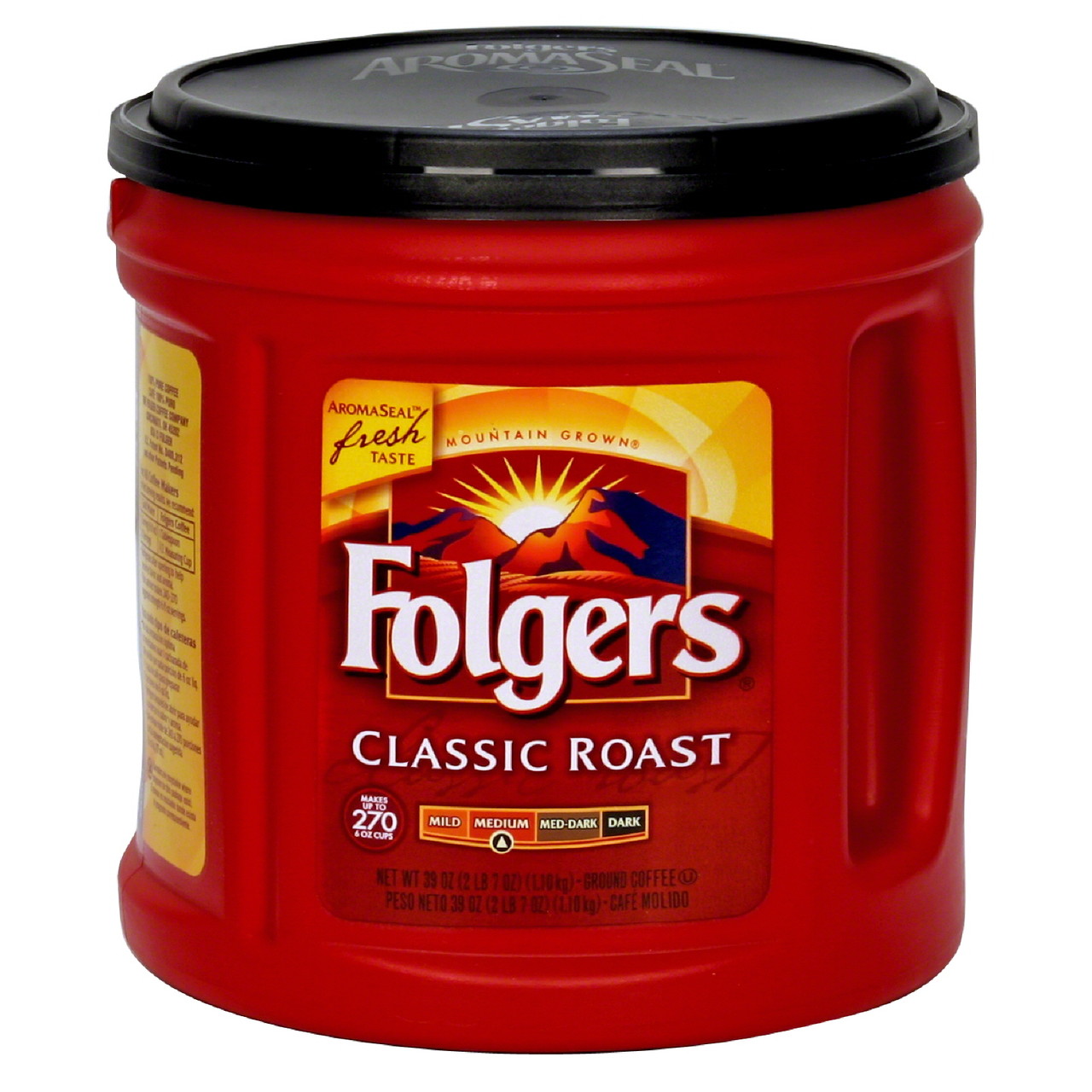
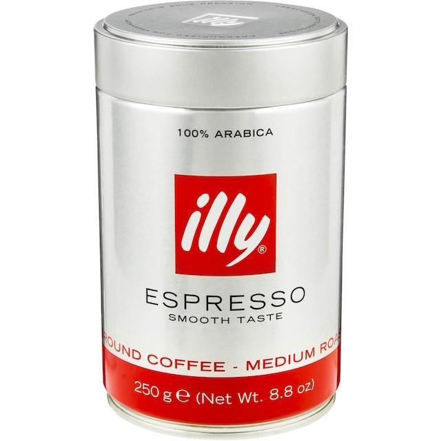
so I decided to check my kopi palette, a palette trying to find the platonic ideal palette that seems to underly all coffee related ephemera, against a an image search for “coffee related ephemera” . how do you think i did?
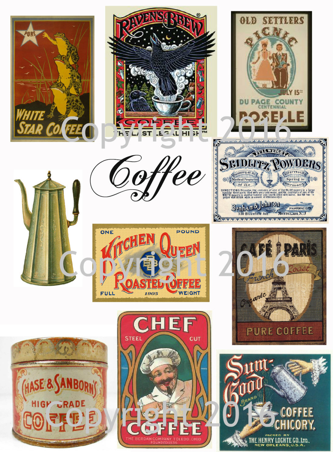
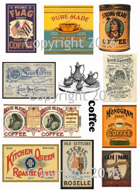
even modern brands seem to basically stick to the palette, with the exception of swapping the off white/cream color for bleached white or silver.
so why though? part of the palette seems to be based on picking colors around the color of coffee grounds, and milky coffee. then you have the red and green of the italian flags, and the weird obsession with 1900-1930s ads and tin printing tech.
why navy blue though? mustard yellow?
my kopi palette doesn’t have a pure black or pure white. those do show up, but rarely enough for me to think i don’t really need to include them
hmm. i don’t have that blue. do you think that matters?
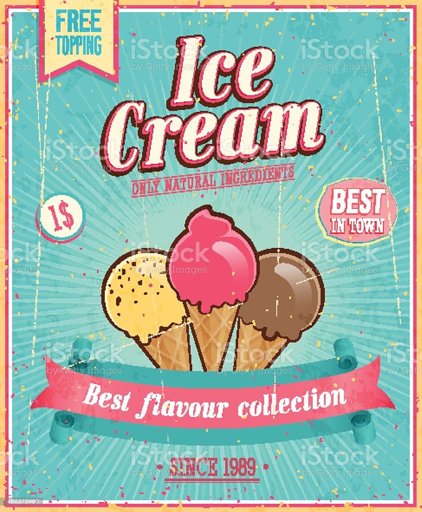
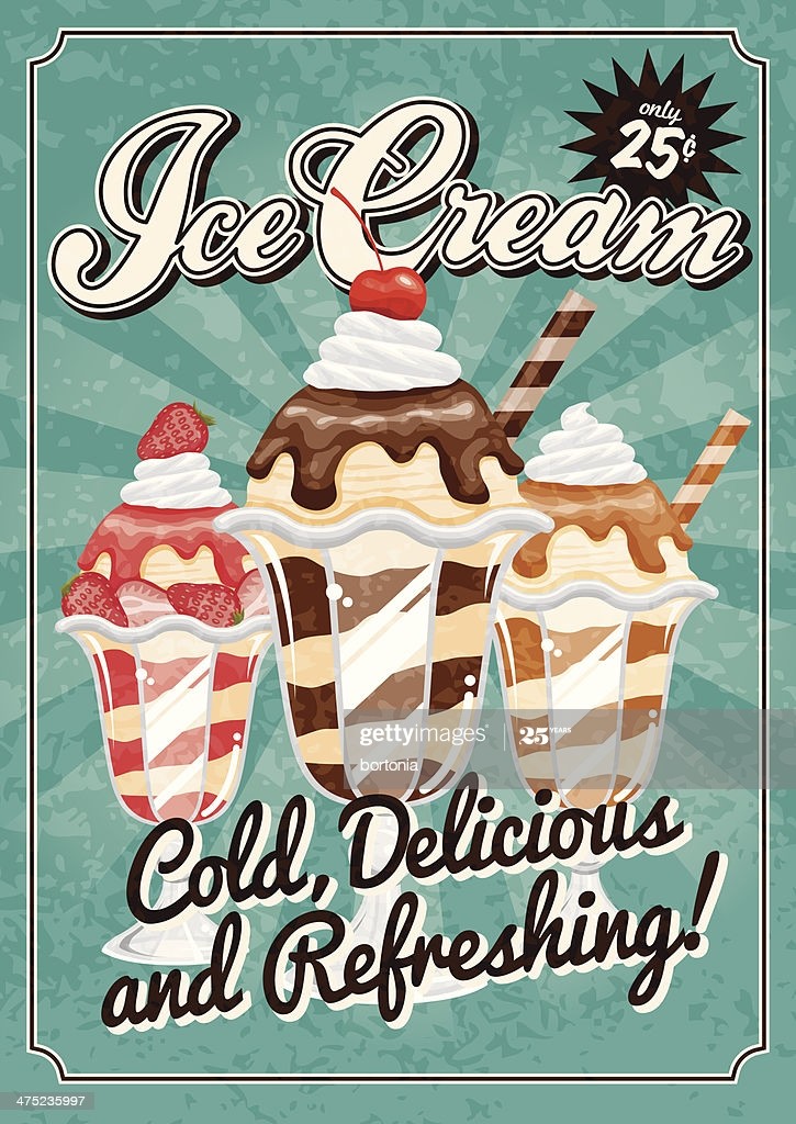
i sorta think that blue and these posters really belong in an adjacent “ice cream “ palette with more mint inspired greens and a brighter blue.
in the coffee alchemy website we see a list of coffee logos that mostly stick to the kopi palette
including one for “hairy chest” with a light blue. i suppose … that it is achievable with a half tone of the navy blue.
coffeealchemy.com.au/collectio

pokémon café game. seems to mostly match the kopi palette.
The Legend of Coffee by Paloma Latorre
Hah, it would appear someone else has converged on an EXTREMELY SIMILAR palette to kopi, but based on “70’s zines”
lospec.com/palette-list/70s-zi

Download this palette for free as a PNG, PAl, ASE, TXT, GPL or HEX file.
@smiffy: To me, fairly heavy drone metal. But that’s more about my relationship with coffee, Caffeine O)))
me: a lot of music boxes are possible, one wonders why 1980’s arcades so limited themselves to bleeps and bloops. consoles with BOM’s i get. but they could have put an amp in an arcade machine and put strings on pickups or build all kinds of rad tooth rattling machines.
@smiffy: Ughughugh, I would SO love to have the resources to build something like that. Fascinated by musical boxes, fairground organs, player pianos…
I could do it, but would have to be funded to do so, because I don’t have the spoons to have hobbies that extend beyond simple design.
@Deborah PickettMustard yellow could be one of the range of colours that occur in crema.
me: and navy blue is a pretty good complementary to that
Does your palette extend to ephemera outside the caffeinated beverage industry? I suspect it might, because it reminds me a lot of the colours popular in the Art Deco movement of the 1920s and 1930s. It wouldn’t surprise me that the coffee posters were channeling that vibe themselves even after the period ended.
Maybe there is a technical factor? Perhaps the palette of colours available to printers at the time was limited to that gamut, with the olive greens and mustard yellows etc
me: there does seem to be a technological constraint yes. i suppose an aspect of the palette is an obsession that modern coffee ephemera has with recreating a feeling from coffee tins and posters from a particular era, which is constrained to a specific palette, and constrained again by the choice of “coffee themed” colors out of that set.
i found an adjacent and overlapping palette that recurs in ice cream related ephemera
IANA art historian etc etc but espresso coffee dates back to c. 1900–10 and ice cream parlours and soda fountains peaked c. 1940–50. It would not surprise me to find out that the palettes you developed match those available at those times. That modern palettes copy this doesn’t surprise me. Advertising loves to throw back to golden ages. Is it deliberate or has it just become tradition copied without understanding? IANA art historian etc etc.
me: well, at some point, a logo, package design, or advertisement poster is trying to evoke a feeling, and over time the early choice become the shorthand visual language- e.g. the recurring tropes in movie posters that have been honed to the point where you can tell whether something is sci fi, action, romantic comedy, etc from the briefest glance at the color palette and composition.
me: so, and that’s just kinda my belief informed by me having an art history ish background. there’s a linguistic component where the early pioneers struggle to evoke the feeling of whatever thing is new, then later designers and artists just evoke the feeling of the best previous designs for the thing
me: but, there is something a little depressing about it too- the theory of postmodernism which posits that art history is essentially “over” and the only thing that is even possible now is reference, and nostalgia. we’ve reached our peak in 1980 and now our culture is stagnant and there’s no new progress to be made.
It’s striking how often this attitude of history being finished pervades so many disciplines. It reminds me of physics shortly before 1905 or genetics shortly after 1953. And of course it’s been wrong every time.
me: well, if it’s wrong in this case, the winter isn’t over yet, it seems to just be getting colder.
+
me: on the other hand, there’s the alternate theory that no matter when it is, it will always seem like nothing new is happening, and that distinctive art “movements” are only visible in hindsight
me: at the time they are happening, there is simultaneously a lot more noise- more things happening than will be clearly remembered, and that noise will at the time look similar to what will later stand out, and the overall color will look like nostalgic reference
me: there is also the weird thing where there’s some new medium, the first thing that happens is recreating the themes of the old art in the new medium, with the limits and the flaws of the new medium at the time feeling cheap and gaudy. then later, when there’s an even newer medium, the flaws and limitations of the older medium are recreated in the new to evoke a feeling- whatever it is that was felt at the peak of the older medium, which isn’t clear until after it is dead or old.
me: that’s simulacra and simulacrum, by jean baudrillard which is - uh, i guess required reading
me: and i have been alive long enough to notice the pattern that some of the most reviled art of a time is what gets most fondly (or at least clearly) remembered later.
me: anything truly new is almost universally hated at the time it debuts.
except by black americans. so there’s a lesson in that too i guess.
I wasn’t properly introduced to 20th-century art until adulthood, so I remember a time when I found it aloof and inaccessible (“lost up its own arse” I bet I would have said). I suspect that my former opinions are common in the populace and that the pool of opportunity for new art to arise from within has become limited. From the inside it may feel moribund. More likely the next big thing in art will come from outside, say, computer-assisted art, and it’s probably already here.
I should use that if I ever actually start a coffee blog.